Previously a production blog for my final year project ( you can still find the old posts of WIP images) YOu have stumbled across a collection of knick knacks and tutorials for 3D CG...
Wednesday, March 31, 2010
Sunday, March 28, 2010
Norma/Displacement tearing
Number of people ran into this problem where you notice a tear in the displacement when rendered with mental ray.
If you take a closer look at the render you will notice that this tear appear at the UV border edges, and that is due to the fact that the sub-division approximation is smoothing the UV brooders, that’s why the displacement edges don’t match anymore.

To fix this problem we need to disable this new method of approximation called the CCmesh, by running this MEL command
addAttr -ln “miExportCCMesh” -at bool mentalraySubdivApprox1;
where “mentalraySubdivApprox1” is the name of your approximation node.
However this comes with price, the CCmesh is much aster node to render and once you disable it. You will get a hit at render time.

Creating A Clean Gray Colored Rendering
First you must make sure that all the objects you want are colored gray. The default lambert material has the best results. Your model should be sitting on a floor of some type. This floor should also be assigned to the default lambert.
Creating And Setting Up The Area Light | |
Step one - Create an area light from the rendering shelf.
Step two - Select, move and scale and rotate the area light so it's shining down and it's larger than the object.
Step three - Open the attributes editor (window>attributes editor).
Step four - Roll down until you find the tag shadows and then the ray trace shadow attributes tag.
Step five - Check use ray trace shadows. Set the shadow rays to 40 (you can get by with less) and set the ray depth limit to 9.
Mental Ray | |
We're going to be using Mental Ray as our rendering software. First we have to set some camera attributes.
Step one - On the view port menu go to view>select camera.
Step two - In the attributes editor roll down and find the tab environment. Set the background color to a light gray. Mental Ray will use this background color for sampling Final Gather.
Step three - Now we have to open up the render settings. Click on the screen icon.
Step four - Set the render using to Mental Ray. Now click the tab Mental Ray in the render settings.
Step five - Set the quality preset to production. In the section Secondary Effects, check Final Gathering.
Step six - Now we need to set some Mental Ray attributes for our area light. Select the area light and, in the attributes editor, roll down and find the tag Mental Ray, and then area light. Check use light shape.
Step seven - Set the high samples to 200, and the high sample limit and low samples to 100.
Now render your scene. If your rendering takes too long, try lowering the Mental Ray attributes of the area light and lower the shadow rays and ray depth.
Hello, my name is Daniel Vijoi and I have been working in the gaming industry for 7 years. My current job is Lead Texture Artist at AMC Studio, a Romanian game development company based in Bucharest. During this time I worked on many projects like TestDrive Unlimited (Atari), Mercenaries 2, Saboteur (Pandemic Studios/EA), Pure (Blackrock Studios/DISNEY), Rise of Nations & Rise of Legends (BigHuge Games/THQ) and other exciting titles yet to be announced. I decided to write this tutorial as I noticed a certain lack of interest for game related environmental texturing in the 3d community. This tutorial is targeted at medium level users and will present the process of texturing a photorealistic building that has already been modeled. I will focus on the texturing process in particular, even though the modeling and UVs are also important for the final look of the building.
For this tutorial, I used the 3Dtotal Texture DVD, a large library of diverse textures that we here at AMC Studio use regularly. At the end you will find a list of all the specific 3D Total textures I have used for each texture I have created. Some of the images included in this tutorial also mention which textures were used.
Usually, it is preferable that one artist does the entire process of modeling and texturing as usually, these processes are interlinked so optimizing the geometry will make changes to the texturing and vice-versa. This is why I will also mention some of the means by which the geometry and UV have to be optimized to keep the textures needed to a minimum while also adding extra details and personality to the asset.
The majority of game assets start their life as a concept art and some reference images that will help to better define the character of the building. For this tutorial I used the following concept art and reference photos. The subject of the concept is a desert building inspired by the settlements on Tatooine and the typical real-life Tunisian buildings. I included some extra Sci-Fi details to make it more interesting. The desert environment will influence the chromatic variation of the textures as well as their detail as far as weather influence on materials goes. Being a multi-purposed building, details vary: there is a generator in the tower and the back side of the building can be used as a market stall to sell different things.
With the help of the above pictures, I modeled the low polygon geometry. The model has 2500 polygons, well under the 2700 polygon budget set initially. This will allow me to add further cuts in the geometry to optimize texture usage later on in the process. Here’s a screenshot of the building geometry from two different angles:
Here you can see the same geometry with the UVs unwrapped. The checker texture was added to make sure all the UV shells are proportional and that there are no areas with deformed UVs.

Before texturing, a quick drawn texture layout would be in order. This can be done either in Photoshop or on paper. This makes the texturing a lot easier if the layout part is sorted out beforehand. Because this process is rather quick, I usually sketch a couple of versions before I decide which is the best one to use. First of all, the entire geometry has to be measured properly so that the UV layout is as compact as possible with as little unused space as possible. Large areas on the geometry will take up more space on the UVs than small areas. In this case, I chose the keep the texture resolution at 128 pixels/meter. This will allow me to keep all the UVs in proportion with each other and also figure out how much space will every detail on the building take on the texture. Having all the parts at the same resolution will ensure that no area of the building will appear to be blurrier than the other.
Because this is a photorealistic building, the textures have to be chosen carefully, so that they do not contain any artifacts due to compression. The artist has to closely follow the color provided in the concept art or, as is the case here, the reference photos if the concept art is not colored. This particular building is part of a desert environment, so the tone of the textures has to match the desert climate.
When choosing the base textures, the most important things to follow are the material details, as the colors can always be modified later. Another good idea would be to choose textures that have a lot of color variation, as this color variation will add a lot of personality to the building.
Here’s how the wall texture for the basic shape of the building was made. The top image is the original texture while the lower one is the result after tweaking the colors with Color Adjustment and a bit of Unsharp Mask.
The next image shows how I added different color tones and a layer of paint to the existing wall. The easiest way is to select the necessary details with Color Range and add them to our PSD. I use this method a lot.
Next up I used a mask (top frame) to add some details from a texture (middle frame) to our map. The result can be seen in the lower frame. The blending mode for that layer will be Normal. This will ensure that the newly created layer will not modify the original texture’s color.
Most of the details can be added in this manner by using masks or Color Range to isolate desirable details from one texture and add them to our own. The final color can always be modified using Replace Color if needed.
One very important thing to take into consideration is the texture resolution. The artist must always be careful when scaling the source textures to both keep the natural scale of the details while at the same time ensuring that particular details will not be sharper or blurrier than the rest of the texture.
Another thing to consider is the management of the PSD files. This will help obtain the maximum texture quality but also decrease execution time when working on a tight schedule. All layers should be named and organized in groups to make sure all the details are easy to find in case they are needed. I try to keep the layers on Normal as much as possible to make sure I keep as much detail from the original texture while avoiding color deviation and artifacts caused by using other blending modes like Hard Light or Overlay. If these blending modes are necessary, it is very important to keep the resulting texture as photorealistic as possible. Softlight seems to be a blending mode suitable for accentuating highlights, shadows, bevels, etc.
Here is one example that follows the above mentioned:
This next picture shows the final wall texture with a bit of saturation added to it:
The two Photoshop guidelines mark the lines that define how the texture is tiled. I needed to make the texture tileable on these lines as the wall is 5.5 meters tall but I only had 4 meter worth of texture to work with. The result is that I had to cut the geometry at 3 meter height and tile the image at that height to increase the usable surface area. This technique is very useful when texturing a high building but you also need to have dripping details at the top and dirt like details at and bottom of the texture. So basically, the middle part (between the guidelines) can be tiled to cover as much space on the geometry as needed while keeping the top and bottom unique.
Here is the same texture applied to the geometry:
This texture not only does it tile with itself but with another texture used for the back of the building. This second texture has been created by using this one as a base and adding some masked details to make it unique.

Here are some further tiled texture examples, this time from assets that are not related to this one:
The same method has been applied when doing the tower wall seen above. To make the tile harder to spot, I reduced the detail of the texture by making the bricks look more alike in color and intensity. Using some masks from the previous texture, I have saved some time when adding dirt at the base of the tower and dripping details at the top. Afterwards, I have used Color Range to select some painted areas from the base wall texture and add them on top of the tower wall texture for added variation. It is often a good idea to use common or similar details for all the textures of the same asset to add unity to the texture and make them fit together better.
After adding these details, I copied a row of stones from the top part of the tileable area and blended it in with the lower part. This will make the texture blend in seamlessly. Usually, making the textures tileable should be kept for last to save time. Also note that the texture tiles vertically to span the height of the tower but also tiles horizontally to make it easier to map it on the circumference of it.
The above image contains a step by step description of the way the roof texture was created. First I added contrast and color to the texture by duplicating the layer and setting the blending mode to Multiply. I then used Color Range to select some of the red paint and increase its intensity. Finally, I added some rust, paint chips and metallic details to make the texture stand out.
Next up is how I extracted the dripping details form a concrete texture to be used for the roof as well as other elements of the building.

Now, to move on to some of the details; first, the entrance door. It is important to remember keeping the PSD files organized and with as few layers and special blending modes as possible to avoid making the final texture look too cluttered.
One layer for each detail type should be enough: rust, chipped paint, scratches, dirt, text, etc. A good idea would be to keep volumetric details as separate layers to make them easier to convert to a normal map later on.
The following image shows how the wood texture was created. When details with clearly defined vertical or horizontal lines are concerned, the first thing to do is make sure they are lined up properly. This will make the tiling process easier.
Optimizing the workflow means that it would be a good idea to keep some textures or elements of the textures in a "library" organized by category: dirt, stains, rust, etc. This will make them easier to find when needed. At the same time, the most interesting elements of the already created textures can be used either for the same asset or for other assets to save up time if necessary.
One last detailed area I’d like to point out is the pipes. Here is the creation process detailed:

To summarize, only a few Photoshop tools are used when creating texture, tools like Color Range, Replace Color or Healing Brush. It is important to keep the number of layers to a minimum and use as blending modes as little as possible. Always keep the resolution consistent throughout the textures. Don’t forget to keep volumetric details as separate layers to make it easier to create the normal map and specular map later. All the time saved from keeping the workflow as organized as possible will give you more time to fine tune the texture or add details to areas that you might have neglected.
The above image shows the final version of the first map, with all the tiling areas. I set my target at using two 1024x1024 textures and one 512x256 alpha texture. Even with the budget restrictions, this should never be an impediment in adding as much details as possible. Adding more details on the tileable textures is always better than adding less when trying to minimize visible tiling areas.
This is the second diffuse texture, with the tiling areas also marked out.
Normal Map | |
The next major step to be taken is creating the normal map. First thing to do is create a height map from the diffuse map we already created. This is by no means realized by just de-saturating the color texture and running a filter, there is more to it than that. A close study of the volumes defined by the color texture is necessary. We start by isolating large volumes like door frames, window frames and large grills. Finer details like wood fiber, rust or chipped paint, which do not have a lot of volume associated to them, should be kept separately so that they do not compete with the large details when converting the height map to normal map. Doing so will result in a final texture that is unnatural and cartoony.
Here’s how the height map looks, basically it is a grayscale map that define the depth of each detail. Contrast is very important as it is the element that will add depth to the resulting normal map
This is how the resulting normal map looks after using the nVidia Normal Map Filter on the previously created height map. You can also use Crazybump or Xnormal for the same purpose. This normal map can be further enhanced in Photoshop before being used. If some details need to be more pronounced, they can be duplicated on the normal map and the resulting layer can be set to Overlay. This will increase the depth of that area.
The same method has been used for the second texture. Here is the height map and the normal map for that texture in one image.
For some areas I have also added normal map details that were not taken from the diffuse map. Here are a few such details that have been added to the previous normal maps with Overlay to add variation to them.
Finally, the specular map:
The specular map’s basic role is to dictate how much light is reflected off a surface. Materials like wood, brick or concrete will have lower specular values while glass, metals and other metals have higher values. As with the normal map, the specular map requires careful examination of the surfaces involved, to guarantee proper results. Some 3d engines might use a grayscale specular map, some a colored one.
In the images below, the bright areas represent the windows with some dark areas for the parts that are dirty. The metal surfaces have brighter values with dark areas for rust and brighter areas for shiny details. The darkest values are for the bricks, concrete and wood. Of course, if the wood is painted, its specular value will be higher, same goes for wet or polished bricks. Another rule would be that older surfaces tend to reflect less light than new surfaces as they are affected by dirt, dust and/or rust, all of which have very low specular values.
In general, the specular map will have more contrast than the diffuse color it has been generated from.
Here is how the specular maps look in this case:
Here is a compilation of screenshots from Maya, using the High Quality Renderer. This is the closest you can get to the ingame image while still using Maya. Similar details can be obtained when using other software packages too.
Before wrapping things up, this is a list of all the 3D Total textures used in this tutorial:
Parts01 texture
- brick15 (02 - aged & stressed)
- brick18 (02 - aged & stressed)
- ceiling_01 (07 - sci-fi textures)
- door_12 (07 - sci-fi textures)
- hull_05 (07 - sci-fi textures)
- metal09 (02 - aged & stressed)
- paint03 (02 - aged & stressed)
- paving03 (01 - general)
- red10 (03 - bases & layers)
- wall10 (02 - aged & stressed)
- wall13 (02 - aged & stressed)
- wall14 (02 - aged & stressed)
-wood_03 (02 - aged & stressed)
Parts02 texture
- african15 (09 - ancient tribes & civilizations)
- brown_01 (03 - bases 7 layers)
- misc09 (02 - aged & stressed)
- normal06 (03 - bases 7 layers)
- paint01 (02 - aged & stressed)
- plaster06 (02 - aged & stressed)
- plaster08 (02 - aged & stressed)
- tile02light07 (05 - dirt & graffiti)
- tile02medium10 (05 - dirt & graffiti)
- tile04heavy01 (05 - dirt & graffiti)
- wall05 (02 - aged & stressed)
- wall18 (02 - aged & stressed)
- window01t (07 - sci-fi textures)
As a conclusion, I leave you with a render of the final asset. I hope you enjoyed this tutorial and hopefully this will help you better understand some of the challenges of texturing for next-gen games.
Monday, March 22, 2010
Maya’s Luminance Depth Preset
Maya’s luminance depth preset can do a lot of things for the finished look of your animation, with a minimal expense of render time. You can use it to generate post controlled fog or darkness, depth based compositing of elements, or for a good, post controlled focal blur.
Maya’s Z Depth channel rendering has a few problems. It’s not easily read or used by your favorite compositing program, it is not anti-aliased so you may get jaggy side effects by using it, and it’s not necessarily the fastest thing to render. TRIED IT!
Setting up depth of field on your camera in Maya is a bit tricky, it usually involves writing some expressions and setting up a rig with locators or something. Great stuff if you are used to it but you have to re-render to adjust the depth look. DONE IT!
First of all I’ll be demonstrating some of the uses using Maya 8.5, After Effects CS4, and Frischluft’s ‘LensCare’ plugin which is a worthy investment for your compositing arsenal even if you are on a budget.
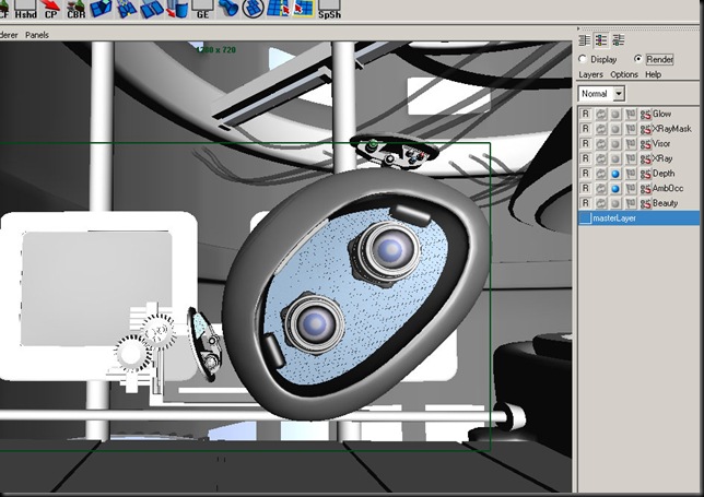
First, in Maya let’s set up a Depth pass. Here you can see a shot where I have done it, but what you want to do is add a render layer, name it ‘Depth’. Right click on it and choose the preset ‘Luminance Depth’. Once you do that you will want to adjust one more thing.
You will want to find the shader override that it created. By default the node gets named setRange1 but you can find and graph the shader if you want. You want to break the max and maybe the min expressions the shader constructed. Why? Because it tries to judge the min and max distance based on the camera view. If you have stuff out of view or way out in the scene including an HDR map, those values will not be optimal.
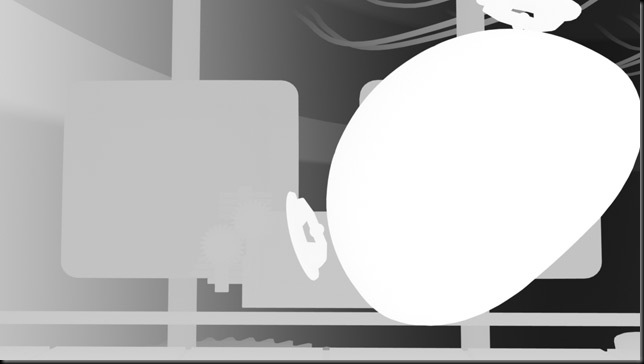
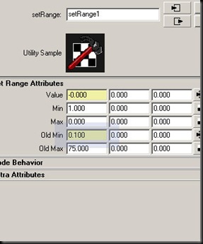 Here in this shot, I found that the Max value it suggested of 300 left the scene too black. Much of the background focal info would be useless. I found that a value of 75 yields the following render for Depth:
Ideally you want the front clipping plane to render as white RGB(1,1,1) while the most distant near black RGB(0,0,0).
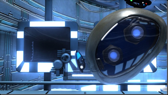
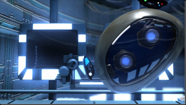
Okay. I’ve compiled the beauty, ambient occlusion, and a glow layer here in AfterEffects and done nothing else. This is ‘before’. The shot was rendered with Mental Ray, using Final Gather and a few incandescent light sources. But no depth of field or really feeling of depth using other means. This is ‘before’.
I want to darken the background behind the subject a little bit. I’m just going to borrow the depth pass and multiply it on the original at 35% opacity. Or maybe you will want to do something like use this for a mask on a solid color to add a post adjustable fog.
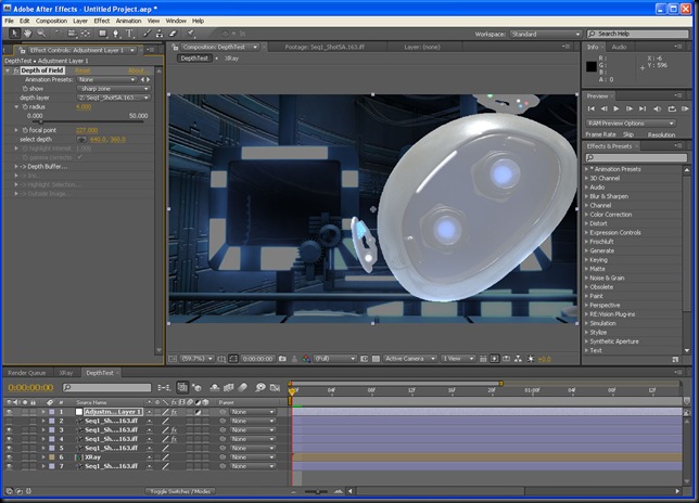
Quickly now let’s finally use it for what we most intended, as Depth of Field. Add your depth image to the top of your composite and hide it’s visibility. Create an Adjustment Layer, add the Frischluft Depth of Field effect. Everything will go blurry. Next, assign your hidden layer from the first of this paragraph. It will look better but not quite there. The properties you are interested in here is radius (lower values are similar to higher F-Stops, while higher values are like lower. I find 2.0-4.0 are good values). Now how you ‘pull focus’ is by using or even animating the focal point property. To do this well I like to show the ‘sharp’ zone pictured below, which will show the infocus region as a white overlay while out of focus regions will have a darker mask applied.
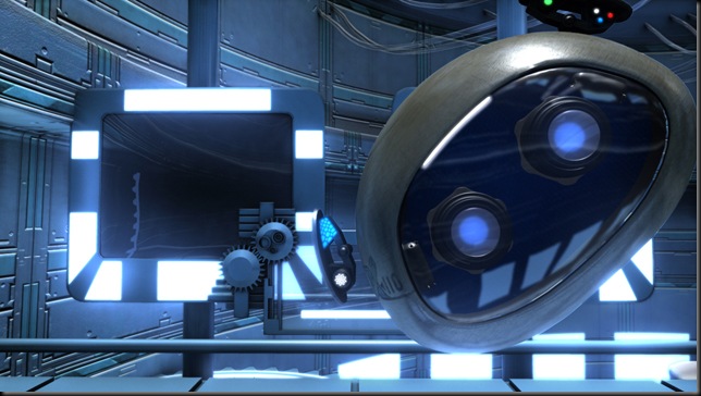
Finally shown is the same shot using Frischluft and Maya’s Luminance Depth preset. The Depth preset is being added both as a multiply layer to darken the background a bit above, and finally being used on my topmost adjustment layer with the Frischluft effect.
The depth preset layer renders in just seconds even at HD resolution since it is scanlined and has a fast shader applied. It’s anti-aliased and can be used for a variety of effects. One technical note, you can duplicate the special shader created by Maya, and either map transparency or adjust it for situations like alpha textures or glass. Often I will just omit glass surfaces altogether from the depth layer so that for instance, window contents in the distance don’t errantly appear sharp.


